My Roles
• UI Design—Designing UI & UI Elements using Figma, icon design.
• UX Design—Sketches, Wireframing, Prototyping, Research, A/B testing.
• UX Writing—Call-to-Actions (CTAs).
Project Context
• Solo student project for CareerFoundry’s UI Design Immersion Program
• May 2023~July 2023 (2 months).
• Created using Figma.
OBJECTIVE
Connecting students online to facilitate peer-to-peer learning, support, feedback, and motivation.
This project was completed as a part of CareerFoundry’s UI specialization course. As such, this project was primarily UI-focused, with some elements of UX Design. I was provided with a project brief to use as a guide throughout this process. The following is a list of guidelines I was provided with to help me get a firm grasp on who, what, when, and where I’ll be designing for.
PROBLEM
International students are at a cultural, and linguistic disadvantage when studying at American universities.
To make this project uniquely mine, I decided to touch on my past experience as an educator to make Internationally valuable to a “real life” audience.”
As a Lead Teaching Assistant for the University of Colorado Boulder, I had the incredible opportunity to teach Japanese in a linguistically and culturally diverse classroom, where only 5-10% of my students were domestic, while the remainder were international.
As the semester progressed, I realized that a noticeable portion of my international students struggled in my class due to linguistic difficulties or difficulties understanding the cultural references in our textbook (which was designed for American students by the University of Kyoto). This leads me to ask the question:
SOLUTION
Students need a community of other international students who understand their struggles.
USER FLOWS & LO-FI WIREFRAMES
UI Design with users in mind.
To keep user needs at the forefront of this project, I conducted a brief competitor analysis of popular social media and study apps and compiled a list of user stories. Keeping my competitor analysis and user stories in mind, I was able to identify key strengths and potential friction points to assemble the following user flow:
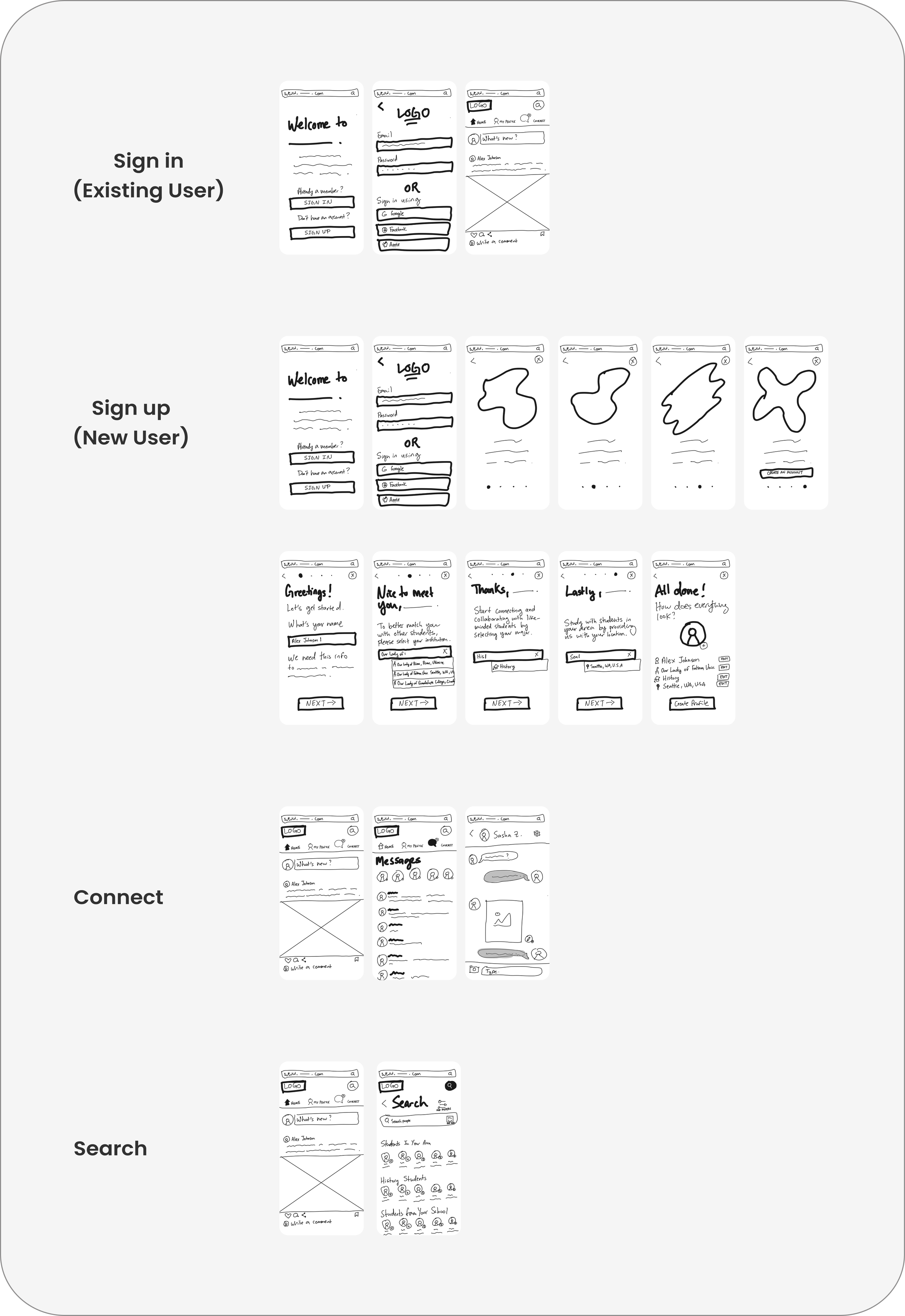
With the foundation laid for my web app, I quickly drafted low-fidelity wireframes for each task highlighted in my user flow. When designing the app’s navigation pattern and dashboard, I took inspiration from popular social media apps such as Facebook and Instagram to prevent cognitive load and keep the app familiar to my target (college-aged) audience.
MOOD BOARD
Finding fun & motivational inspiration.
To establish a clear aesthetic direction for Internationally, I reviewed my original project brief and designed 2 separate mood boards with the intention of only choosing 1. I selected 6 keywords from my project brief and incorporated 3 words into each board to establish core themes. From there, I added images, elements, and colors to match the core themes of each board:
I went with the 1st mood board for the following reasons:
Mood board #1 felt like it had a little more of a purpose as opposed to mood board #2, which was mostly aesthetic.
An A/B preference test coupled with advice from my mentor revealed that mood board #1 seemed more fun and motivating.
The primary color palette of mood board #1 is more suitable for a study app as opposed to mood board #2.
STYLE GUIDE
Consistency is key.
To keep my designs clean and consistent and ensure that I stay on brand, I created an in-depth style guide that includes Colors, Typography, Logo Guidelines, Imagery, Iconography, and UI Elements.
1. Colors
For this project, I wanted to ensure that my color palette included bright, vibrant colors to motivate students and get them excited about studying. I also wanted a color palette that would encompass the diversity and inclusivity of an app for international students—all colors of the rainbow. Here’s what I settled on:
2. Typography
For Internationally, I decided to go with Poppins (a simple, sans-serif font). Poppins works well for this project because it's easy to read and works well with Internationally’s aesthetic. To keep my design simple, I stuck with one font throughout the design (not including the logo).
3. Logo Guidelines
I wanted Internationally’s logo to embody the “essence of academia” without the stuffiness. I went with a less serious sans-serif font called Gotham Condensed to do this. To add a touch of playfulness and brand identity, I replaced the dot on top of the “I” with a slightly askew graduation cap.
4. Imagery
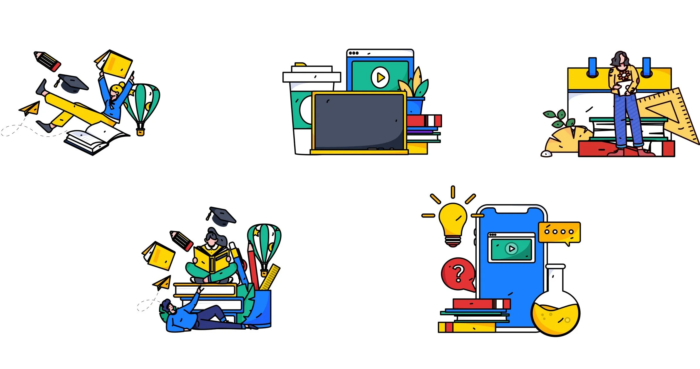
My intention for Internationally's design is to use heavily-lined, flat illustrations as the app's primary imagery. Any other media included in the app's design (such as photographs, PDFs, videos, etc.) is to be uploaded by its users.
Suitable Images:
Aside from pictures and videos of work, imagery should be human-centered, realistic, and on-brand (adhering to color palette and aesthetic).
Non-suitable Images:
Illustration style should NOT be inconsistent, and images should NOT look like professional or stock photos.
5. Iconography
The majority of these icons were designed by myself using Figma. The rest were taken from Unicons. I took inspiration from my mood board to design these icons with thin lines and rounded corners.
The following icons will be colored #34343 (UNLESS used in a text field, in which case the icon will be colored #8F8E8E). Icons can also be colored #FFFFFF to increase contrast on darkly colored background.
Icons are typically 20px. X 20 px. unless they need to fit in small spaces, in which case they will be sized 10px X 10 px.
5. UI Elements
FINAL MOCKUPS
REFLECTIONS & NEXT STEPS
Lessons learned & what I would do differently next time.
• Never underestimate the power of research—While this project was UI-focused, and I was given a persona and project brief, I definitely felt that the absence of user research hindered my ability to empathize with and identify user goals/friction points. If I had more time, I would perform more quantitative and qualitative research tests (such as user interviews, surveys, and A/B preference tests).
• Experiment with new and emerging technologies—If I could redo this project, I would definitely explore how I could incorporate AI technologies to improve user experiences. For example, an app for international students might benefit from text-generating AI to help with English grammar or customization AI.
• Design your passions—I’ve learned that the best way to make a difference in society and to achieve the best results is to design for groups/communities you are passionate about. While designers (realistically) will not always have the opportunity to design for their passions, I am so honored that I was able to continue upon the work I started as a teacher, and hopefully make a difference someday for international students in the U.S.
Overall, I am grateful for this experience and to my mentor Miguel Barrero for all of his invaluable feedback. I am fully confident that I finished this course as a better designer than when I started. I hope to expand upon this app in the future if time permits.


